Designing a Web App for No-Code Users for Efficient Management of RPA Platform Transition Projects
Role
UX Designer
Team
Director of Sales Engineering (Champion)
Freelance developer
Project type
Web application
Tools used
Figma
Illustrator
Duration
4 months
The situation
Transitioning between automation platforms is complicated
In late 2020 and early 2021, during my time at JOLT Advantage Group (JOLT), my role was content design, focused mainly on web design, SEO optimization, and customer-centered initiatives. JOLT was a small Robotic Process Automation (RPA) startup consultancy, so we did not have a large design team. I was the only designer at the company at the moment.
Leadership at JOLT identified an opportunity to create a no-code web application for people to streamline the transition from legacy automation platforms -like Automation Anywhere- to a more robust and scalable platform like UiPath. The CMO proposed I lead the UI/UX design for the JOLT Translate project. I partnered with the Director of Sales Engineering (DSE), the leading project champion and a freelance developer.
Business Objectives
What were we trying to achieve?
Constraints
What restrictions did we have to consider?
Responsibilities
What was I responsible for?
Results
What did we achieve?
the objective
A no-code web app
Leadership wanted to launch JOLT Translate as a no-code web-based SaaS product. The idea came from a growing interest from RPA managers at organizations using Automation Anywhere who needed to transition to UiPath without forcing their organizations to rebuild all their automation workflows from scratch. JOLT Translate would help clients to:
Product's core requirements...
Taking Action
Understanding what was needed
I partnered with the Director of Sales Engineering (DSE) to better understand what screens were necessary and what data would need to be visualized by the users when an RPA platform migration project was underway.
Dashboard
What did users need to do in this screen?
Analyze
What did users need to do in this screen?
Code
What did users need to do in this screen?
early stage design
An idea of what the product could look like
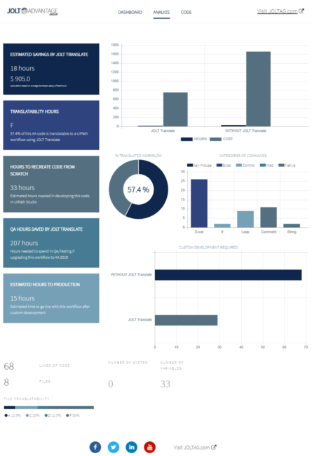
The DSE provided his PowerPoint-made design idea for the Analyze screen – the screen users would spend the most time on. I did not think he proposed the best design to visually represent the requirements they had given me. Still, he was reluctant when I asked if I could come up with something brand new.
This design had a high cognitive load for users...
early stage design
Jumping into mid to high-fidelity from the get-go
At the beginning of the JOLT Translate project, the business set it as a high priority due to the potential market share the company could take by being first to market with a product like this.
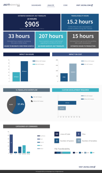
Therefore, leadership requested I jump into mid to high-fidelity designs to quickly flesh out each part of the interface.
This first iteration, I sticked as close to the DSE’s original idea given he was adamant about me not deviating much from his idea.
What I learned...
early stage design
Discussing the current design with the project champion
I met with the DSE, and we reviewed the first design. I went into this meeting with the intention of discussing the possibility of moving away from his original idea and letting me handle design without constraints.
What happened in the first review meeting...
early stage design
Getting support from leadership to advocate for a new design
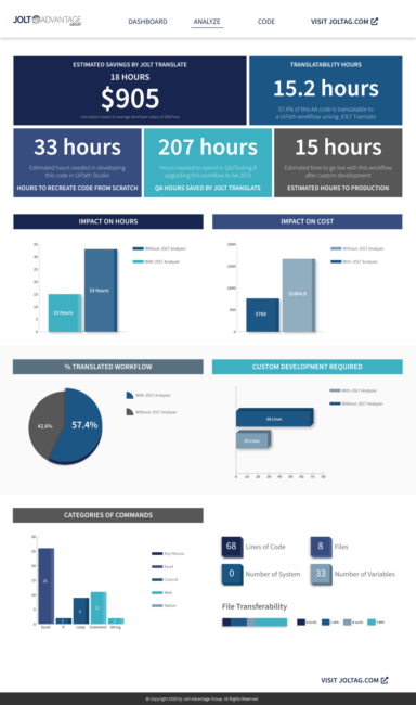
For the second iteration, I modified the elements of the graphs to look 3D. The rest of the design carried over from the first proposal.
Before meeting the DSE again, I contacted the Chief Marketing Officer (CMO) – my manager – for her help in swaying the DSE’s opinion about looking at a new design and me being able to present an interface that would better serve the users.
Breaking through in the second meeting...
A brand new design
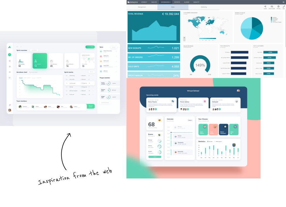
Getting inspired to move away from the original idea
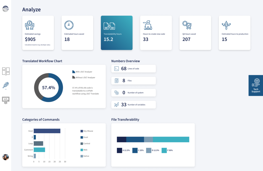
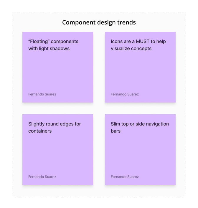
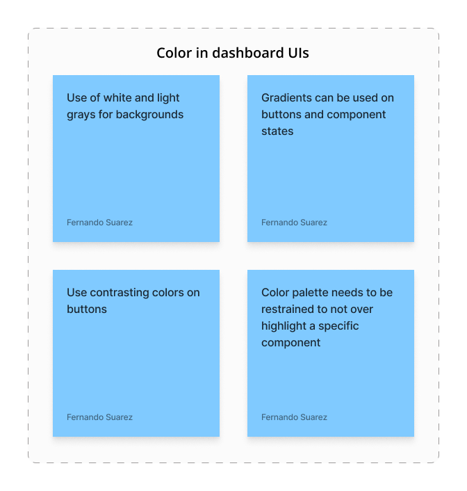
I did a bit of research on trends and how interfaces in dashboards and products looked like back in late 2020 and drew ideas for what I could add to the UI I had to create.
A brand new design
Moving away from the original idea for the product
I created a new design from scratch based on the trends and research I had done. I still had to work within the brand guidelines of JOLT.
I shared the new proposal with the DSE. After a few weeks, he said he liked the new design and wanted to see my idea for the ‘Dashboard’ and ‘Code’ screens based on this latest iteration. So I went back to work.
Some of the components in the new design...
More new designs
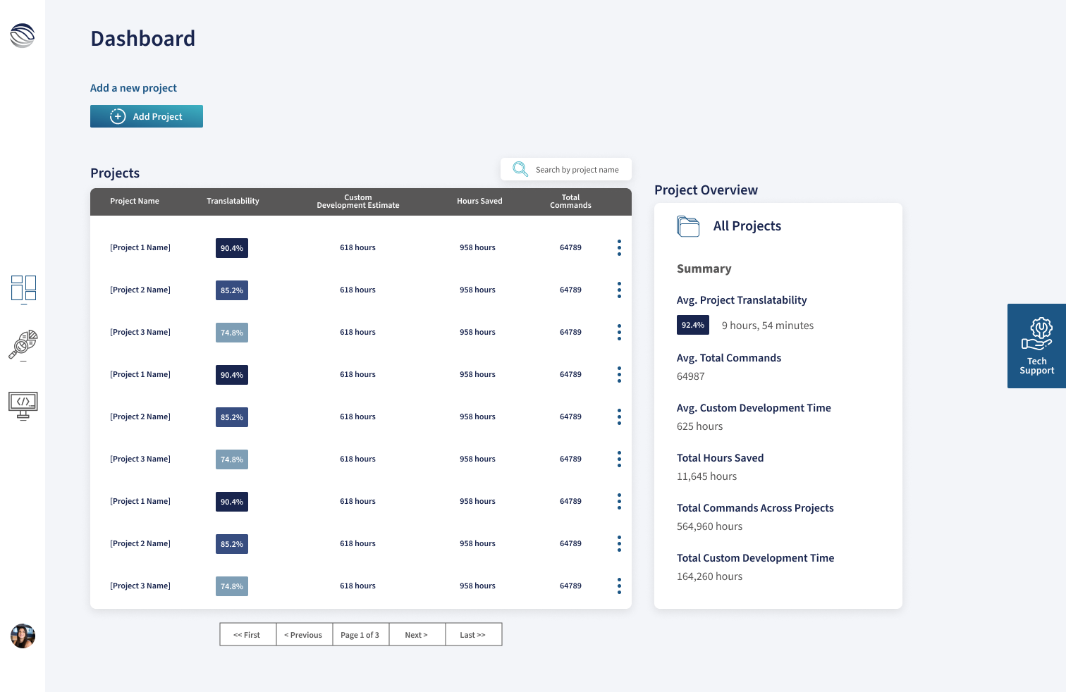
Creating a simple dashboard screen
For the dashboard screen, the initial requirements were:
I created clearly differentiated components that drew from common UI elements that users already know, i.e., the three dots toggle for showing an options menu.
I also designed the screens users would see when uploading a new project.
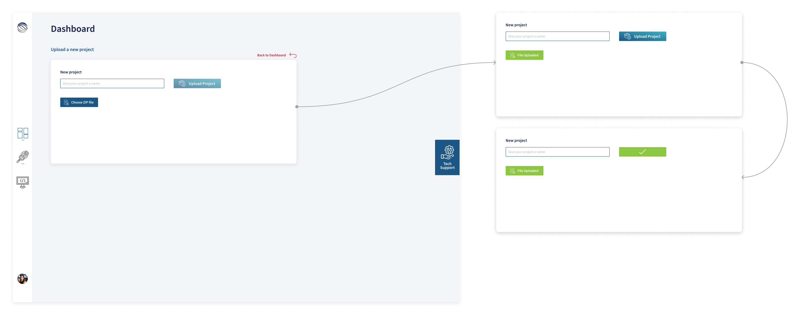
More new designs
Streamlining file exploration
The code screen was meant for users to take a deep dive into each file contained within their translation projects. The requirements for this screen were:
Keeping in line with the look and feel of the other screens, for the ‘Code’ screen, I created a component that showed:
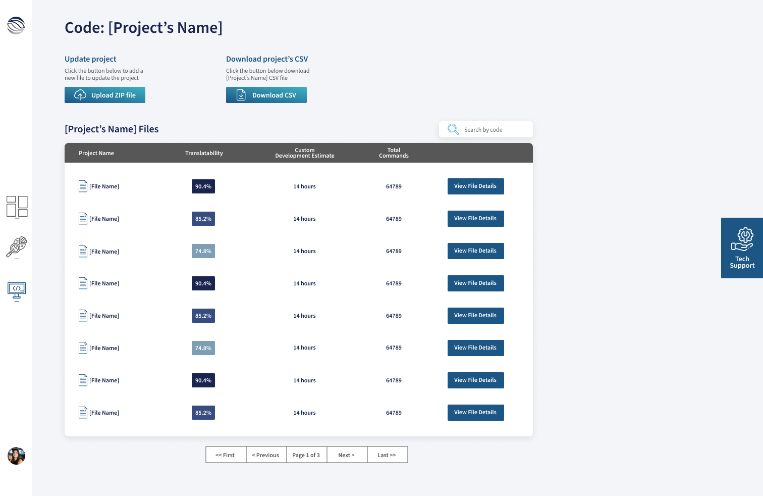
I also created the screens users would see when navigating a file’s details. This screen had three sub-screens: Overview stats of the file, properties of the file, and code deep dive
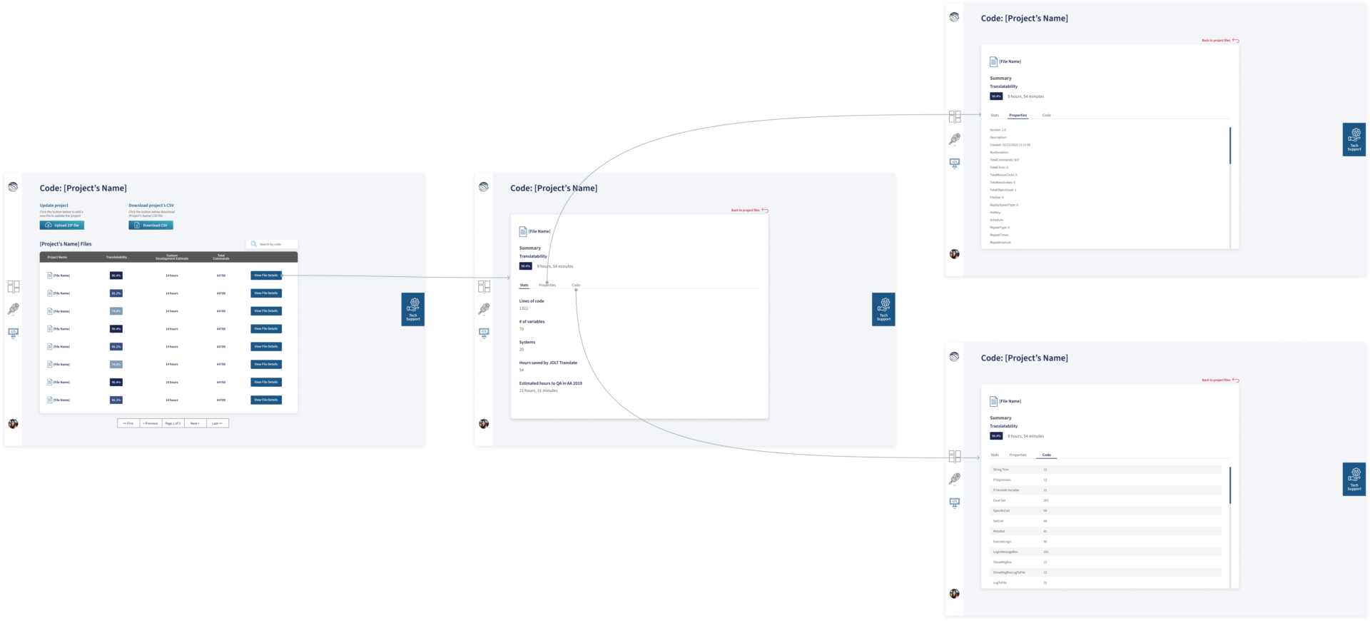
Results
Radio silence followed by no launch
By March 2021, more than three months had gone by. The project was losing traction as the DSE, the project’s main champion, shifted the project to a lower priority tier, and there was radio silence. I did ask for a status on the project multiple times, given that I had handed off the design to the freelance developer.
Again I reached out to my manager to get her support in breaking the radio silence on the project. She reached out to the DSE, and then she and I had a meeting, and the following was discussed:
Therefore, no further design and development would be needed as our new parent company, Roboyo, was not interested in the JOLT Translate product.
