Designing a new website for Kuriyama Mexico to reduce bounce rate and improve readbility

Role

UX Designer

Project type

Responsive website

Tools used

Figma

Illustrator

WordPress

Overview

Kuriyama of America is a global organization with over 50 years of experience in the rubber and plastic products industry, offering a variety of industrial parts for construction machines and more. As part of its global reach, Kuriyama has a presence in Mexico, where its office was seeking to develop a new website that would set them apart from the American one.

Kuriyama Mexico approached us to design and develop a new website that would showcase their extensive catalog of products while adhering to the global brand’s visual guidelines. Our task was to create a lightweight and optimized website that was user-friendly and easy to navigate. Additionally, we had to ensure the website complied with Google’s Core Web Vitals to improve its search engine ranking.

Objectives

πŸ€”

What were we trying to achieve?

πŸ“Œ
Host all of the company's catalogs
πŸ“Œ
Connect to other Kuriyama websites
πŸ“Œ
Set Kuriyama Mexico apart from the US branch
πŸ“Œ
SEO optimization

Constraints

🚧

What restrictions did we have to consider?

πŸ“Œ
Keep the website lightweight to achieve better rankings
πŸ“Œ
Align the design with the global brand while still creating a unique look
πŸ“Œ
Client needed to launch in 8 weeks maximum

Responsibilities

πŸ“‹

What was I responsible for?

πŸ“Œ
Visual design of the Mexico website
πŸ“Œ
Leveraging a visual builder, HTML, and CSS to create the website inside WordPress
πŸ“Œ
Using HTML, CSS, and JS to create a custom widget for product search across multiple URLs
πŸ“Œ
SEO optimization for the Mexico site

Results

πŸš€

What did we achieve? (2021 to 2022 YoY)

πŸ“Œ
Website avg. bounce rate of 38.43%
πŸ“Œ
Sessions increased by 200%
πŸ“Œ
Users increased by 143%

The problem

Setting the Mexico branch apart from the US

To design and develop a new website for the Mexico-based branch that would set them apart from the US one while still aligning with the global brand and the vision of the Mexico and US team.

Visual exploration

Collaborating with both the US and Mexico teams to create a unique design

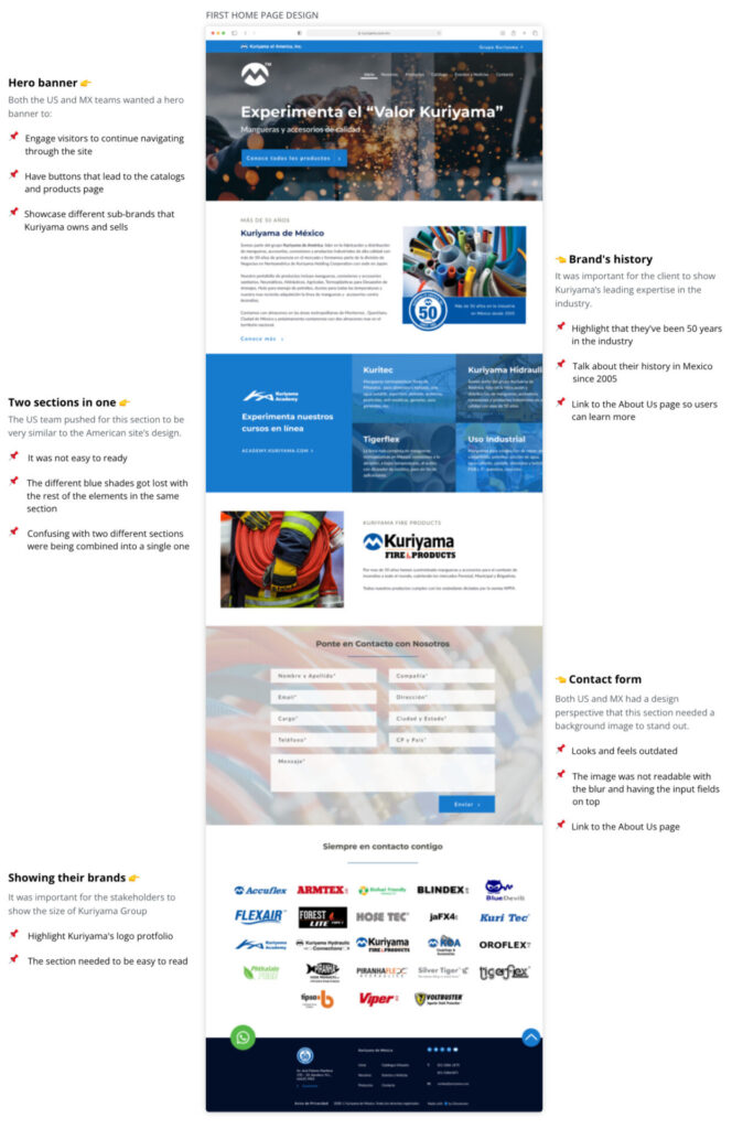
During the visual exploration phase, I worked closely with the US and Mexico teams to ensure that Kuriyama Mexico’s website aligned with the global brand guidelines while still having a unique design.

It was important to strike a balance between maintaining a consistent look and feel across all Kuriyama websites and allowing Kuriyama Mexico to differentiate itself in the market.

What I did...

πŸ€“
πŸ“Œ
Conducted multiple rounds of design iterations
πŸ“Œ
Collaborated with the US and MX team to incorporate their ideas in the design
πŸ“Œ
Created high-fidelity designs
Hero banner πŸ‘‰

Both the US and MX teams wanted a hero banner to:

πŸ“Œ
Engage visitors to continue navigating through the site
πŸ“Œ
Have buttons that lead to the catalogs and products page
πŸ“Œ
Showcase different sub-brands that Kuriyama owns and sells
Two sections in one πŸ‘‰

The US team pushed for this section to be very similar to the American site’s design.

πŸ“Œ
It was not easy to read
πŸ“Œ
The different shades of blue got lost with the rest of the elements in the same section
πŸ“Œ
Confusing with two different sections being combined into a single one
Showing their brands πŸ‘‰

It was important for the stakeholders to show the size of Kuriyama Group

πŸ“Œ
Highlight Kuriyama's logo protfolio
πŸ“Œ
The section needed to be easy to scan
πŸ‘‡ First home page design
πŸ‘ˆ Brand's history

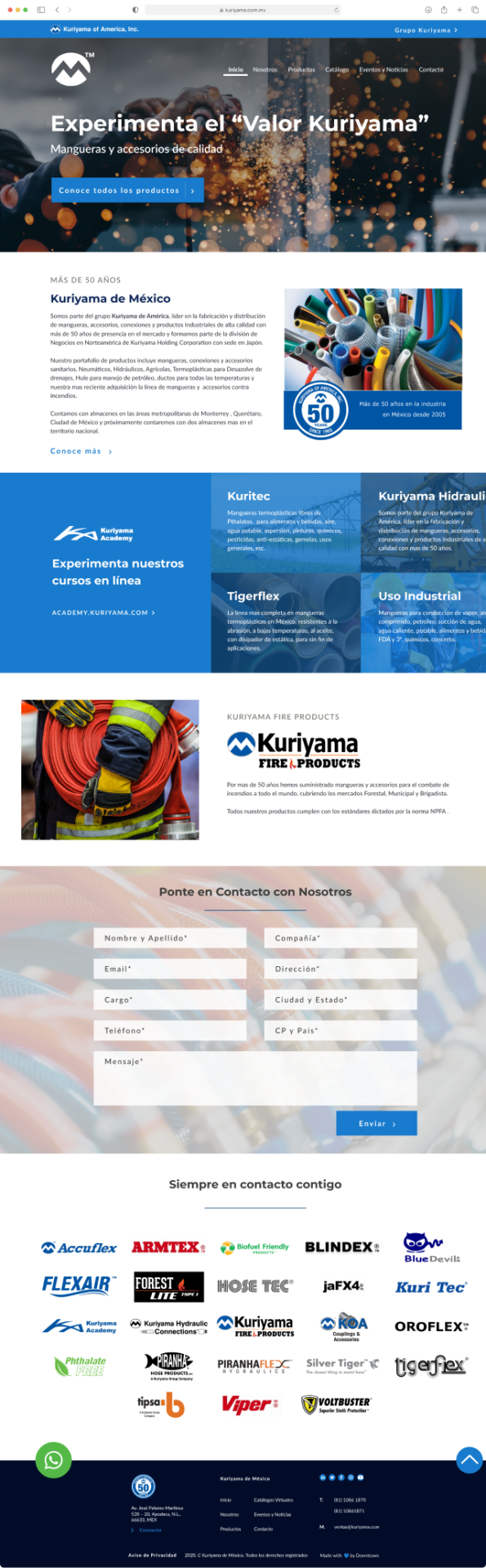
It was important for the client to show Kuriyama’s leading expertise in the industry.

πŸ“Œ
Highlight that they've been in the industry for 50 years
πŸ“Œ
Talk about their history in Mexico since 2005
πŸ“Œ
Link to the 'About Us' page so users can learn more
πŸ‘ˆ Contact form

Both US and MX had a design perspective that this section needed a background image to stand out.

πŸ“Œ
Looks and feels outdated
πŸ“Œ
The image was not readable with the blur and having the input fields on top

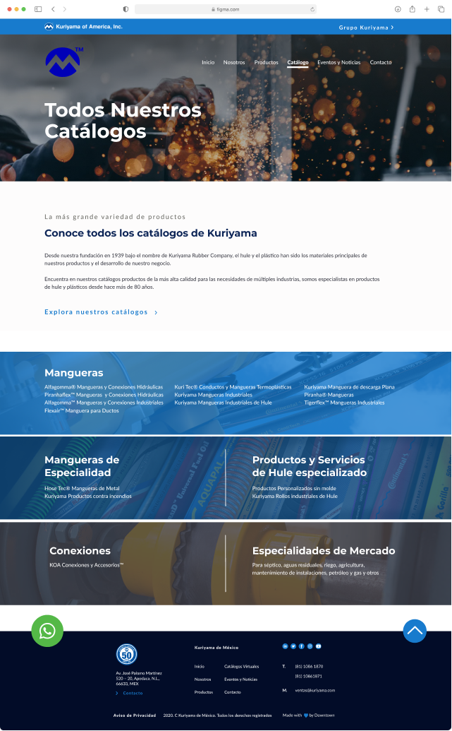
Initial catalog page design

Setting a starting point for further iteration

The initial design for the catalog page did not meet the requirements of the US and Mexico teams, resulting in further design adjustments to meet both teams’ visions.

What was lacking...

❌
Initial design focused on creating an index page with clustered catalogs displayed as text hyperlinks.
Design lacked the functionality to enable users to search the catalog library and select multiple categories.
Catalog covers could not be scanned, which was crucial for the user experience.
πŸ‘‡ First catalog page design

Stakeholders

Aligning perspectives between the US and MX teams of Kuriyama

πŸ“Œ
I was challenged with differing design perspectives between the US and MX teams during the Kuriyama project
πŸ“Œ
The US team had a traditional and dated view of design, while the MX team wanted a modern and visually appealing look
πŸ“Œ
Helped the teams understand each other's perspectives through various meetings
πŸ“Œ
Worked towards finding a common ground by presenting design options that incorporated both traditional and modern design elements
πŸ“Œ
Explained the reasoning behind each choice to help the teams come to a consensus on the overall look and feel of the website

Final design

Creating a modern, simplified look for the home page of the website​

In the final design iteration of the Kuriyama Mexico website’s home page thatΒ helped create a visually appealing design aligning with the global Kuriyama brand guidelines while also allowing Kuriyama Mexico to differentiate itself in the market.

What I did...

πŸ€“
πŸ“Œ
Reduced the amount of text overall to lower the cognitive load on users
πŸ“Œ
Simplified the contact form and downsized the logo portfolio section
πŸ“Œ
Created representative icons to simplify the products category
Slider hero banner πŸ‘‰

It showcased Kuriyama’s products and provided an interactive element for users to engage with.

πŸ“Œ
Showcases the major brands Kuriyama offers in Mexico
πŸ“Œ
Added one button per slide that leads to key pillar pages or subdomains
πŸ“Œ
Lightweight background images for a fast LCP (Largest Contentful Paint)
Separate section for Kuriyama Academy πŸ‘‰

Simplified design for improved readability and reduced cognitive load

πŸ“Œ
Simple mockup design of one of their online courses
πŸ“Œ
Got rid of the blue shades in favor of a grey background
πŸ“Œ
Improved contrast
Showing their brands πŸ‘‰
πŸ“Œ
Reduced the overall size of the logo portfolio
πŸ‘‡ Final home page design
πŸ‘ˆ Custom widget

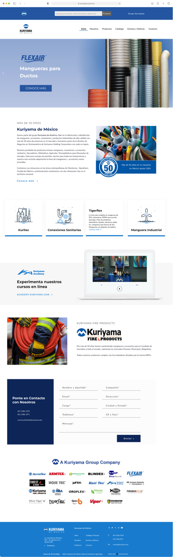
The US team required a widget that allowed users to search products using various criteria.

πŸ“Œ
Searches through the US website's product database
πŸ“Œ
I used HTML, CSS, and JS to achieve the desired result
πŸ‘ˆ Product categories flipcards

Simplified this section by:

πŸ“Œ
Creating an icon and card container for each category
πŸ“Œ
Adding a hover state to display the description of each category
πŸ‘ˆ Simpler contact form

I convinced both US and MX teams to use a simpler contact form:

πŸ“Œ
Removing the blurry background image
πŸ“Œ
Adding the contact info for the offices next to the input fields
πŸ“Œ
Simplifying the input fields design for easier readability

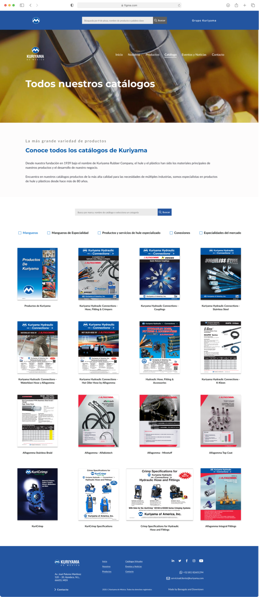
Final design for the catalog page

Thinking about how to better serve the end users of Kuriyama

During the final design of the catalogs page, I created a new interface to make it easy for users to find and filter catalogs.

How I changed the design...

πŸ’‘
A grid layout was used to display covers of all available catalogs.
Search bar and checkboxes were added to filter catalogs by category.
Pagination system was suggested instead of infinite scroll to make it easier for users to navigate to the catalog they were looking for.
πŸ‘‡ Final catalog page design

Custom widget

Creating a custom search bar that pulls data from the US website

I developed a custom search bar for the Kuriyama Mexico website that allowed users to search for products using part numbers, product names, SKUs, or keywords. Here are the details:

πŸ“Œ
The US team requested the implementation of a search bar that worked similarly to the US website's search bar.
πŸ“Œ
The search bar had to display relevant search results based on the user's query, utilizing the US product database.

What I did...

πŸ€“
To achieve this, I created a custom widget using HTML and CSS that was placed at the top of the Kuriyama Mexico website.
For the functionality, I used JavaScript to create a script that would open a new tab, input a custom URL, and add the user's query to the URL string.
The URL string was then sent to the US product database, which searched for relevant results based on the user's query.
Once the search was completed, a results page was generated, displaying all products related to the user's search query.

Results

Increasing engagement, improving the search ranking, and enhancing the experience

What was achieved...

πŸš€
πŸ“Œ
The website had an average bounce rate of 38.43% for the last calendar year
πŸ“Œ
The number of sessions increased by 200% and the number of users increased by 143%
πŸ“Œ
Custom widgets were developed for the "Grupo Kuriyama" menu and for product searching by SKU, name, or keyword
πŸ“Œ
SEO optimization was implemented across pillar pages and catalog pages
πŸ“Œ
The website achieved an A grade in GTMetrix with 99% performance and 82% structure
πŸ“Œ
The Core Web Vitals metrics for the website were CLS of 932ms, TBT of 9ms, and LCP of 0

Looking back

Learnings and Takeaways

Different design visions can co-exist
I facilitated conversations among agency, US, and MX teams to explain the design direction and its benefits for the project's objectives.
Learning is crucial for every project
I expanded my web development skills through creating custom components that required exploring new techniques in HTML, CSS, and JavaScript.
Make time for design refinement
I should have advocated for more time to experimenting and prototyping. I had to start with high-fidelity designs due to time constraints and client preferences, limiting my ability to prototype the designs.
Expert support could save time
I faced challenges with custom website components that required a significant time investment to debug and optimize. While I have experience in HTML, CSS, and JS, consulting with a developer could have been helpful.
Communication, communication, communication
Leading the Kuriyama project required effective communication with stakeholders to ensure that objectives were met on time and expectations were being managed between two different teams.