
Chiquihuite MX
Role
UX Designer
Project type
E-commerce website
Tools used
Sketch
Illustrator
WordPress
Live website
Overview
Chiquihuite MX is a Mexican-based startup committed to promoting local producers and fair trade practices. Their mission is to support local farmers, producers, and crafters by selling a range of vegan snacks, crafts, drinks, juices, and organic products.
At the beginning of the pandemic, Chiquihuite MX approached us to develop a new e-commerce website that would allow them to sell their products online and become business resilient for the incoming lockdowns. As the project’s lead designer, I created an intuitive and user-friendly website that would help them achieve their business goals.
Objectives
What were we trying to achieve?
Constraints
What restrictions did we have to consider?
Responsibilities
What was I responsible for?
Results
What did we achieve?
The problem
Business resiliency for the pandemic
Designing and developing an e-commerce website to sell their locally produced organic products during the pandemic while supporting fair trade and local producers.
Additionally, there was a need to train key stakeholders on managing their online store using WordPress and WooCommerce.
Visual exploration
Optimizing the design process to meet the deadline
During the Chiquihuite MX e-commerce project, the team and I faced a tight deadline for launching the website, which made time management a crucial aspect of the design process.
To optimize our time, I conducted the visual exploration phase in parallel with other project phases.
What I did...
Home page
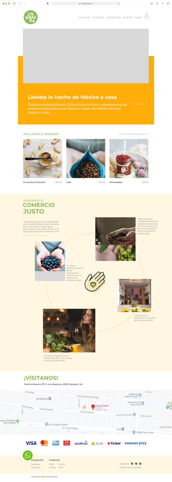
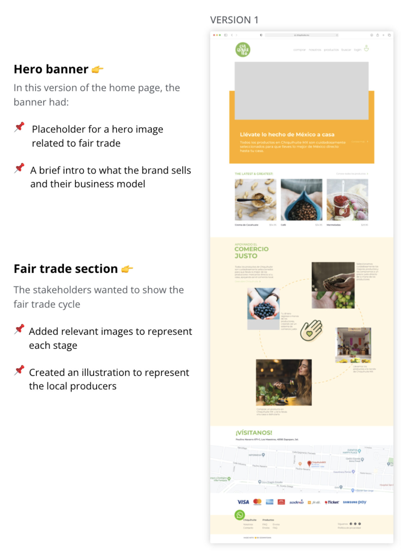
In this version of the home page, the banner had:
The stakeholders wanted to show the fair trade cycle
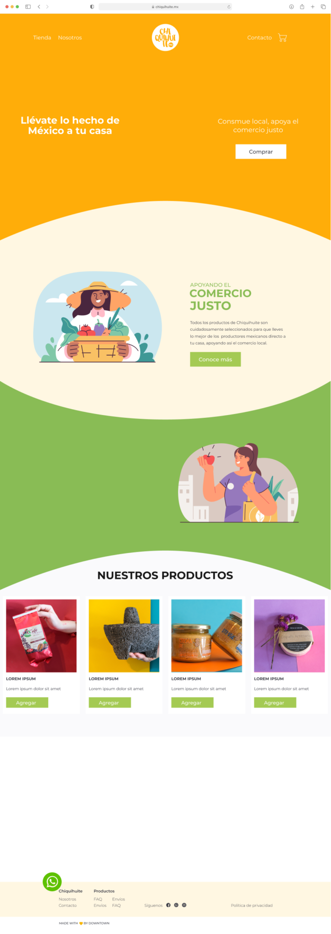
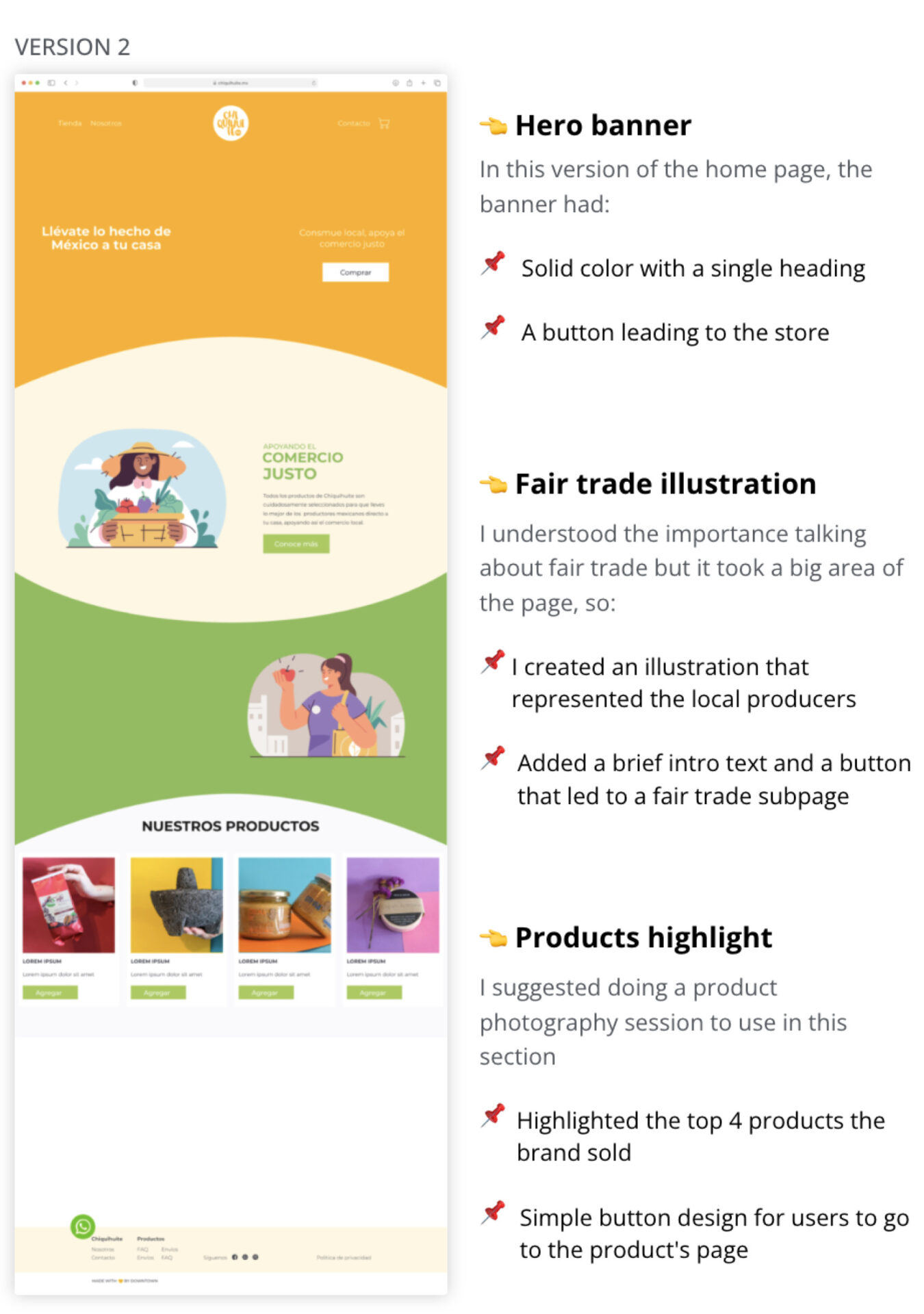
In this version of the home page, the banner had:
I understood the importance talking about fair trade but it took a big area of the page, so:
I suggested doing a product photography session to use in this section
After two design iterations
Getting to the final design to move on to development
What I learned...
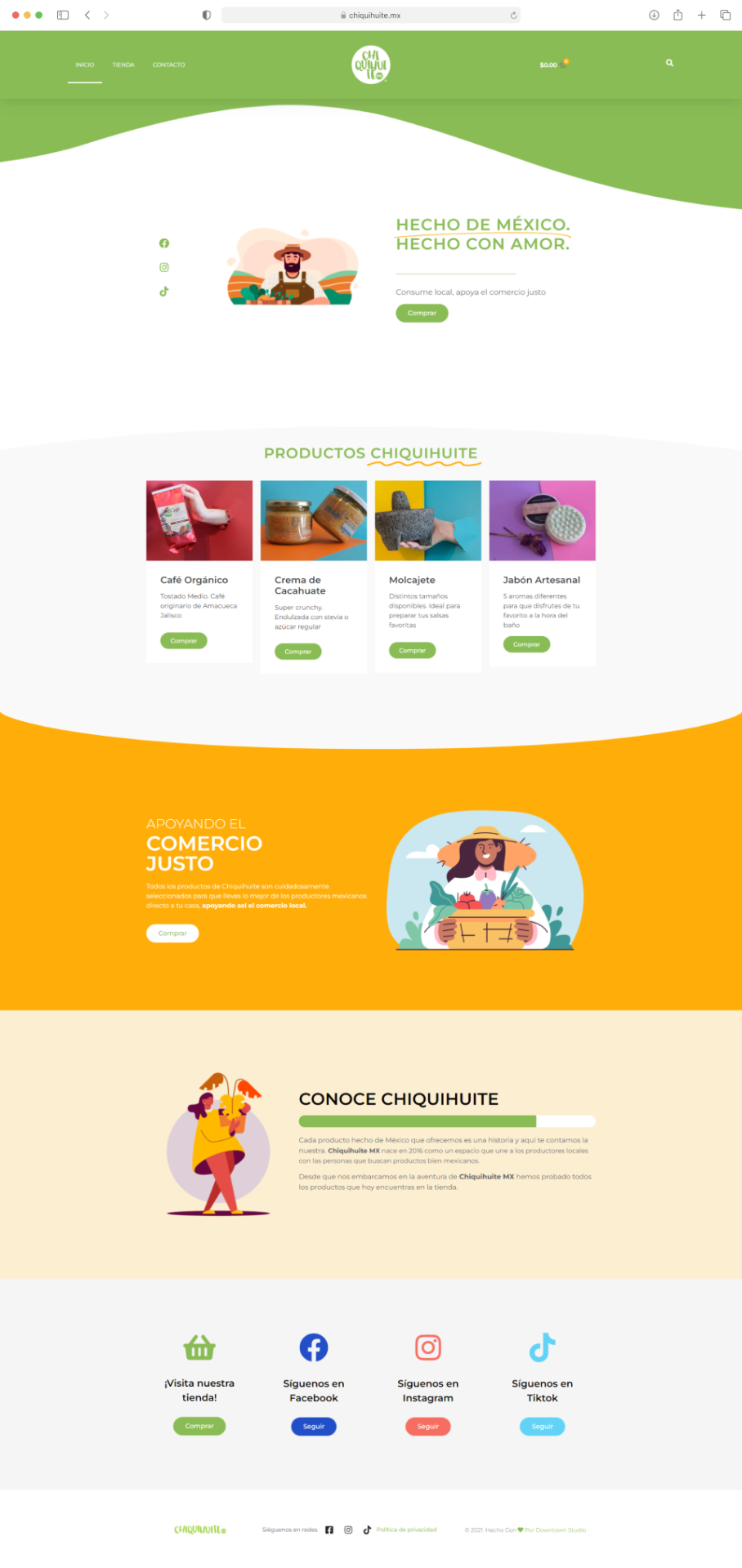
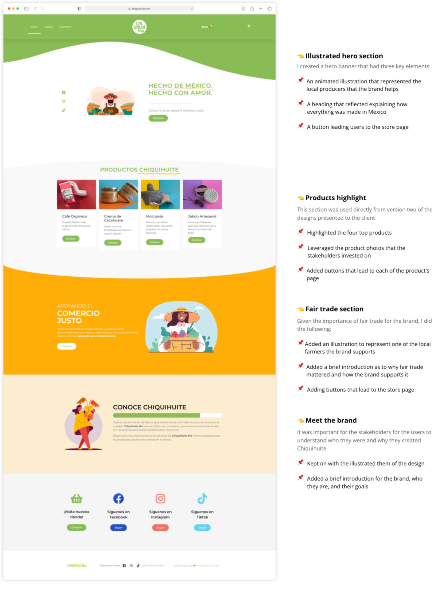
I created a hero banner that had three key elements:
This section was used directly from version two of the designs presented to the client
Given the importance of fair trade for the brand, I did the following:
It was important for the stakeholders for the users to understand who they were and why they created Chiquihuite
PRODUCT DOWNSELECTION
Selecting the top priority products to meet the deadline
I suggested the stakeholders should down-select the number of products to be featured on the website, ensuring that we could launch a the end of the fourth week of the project.
What I did...
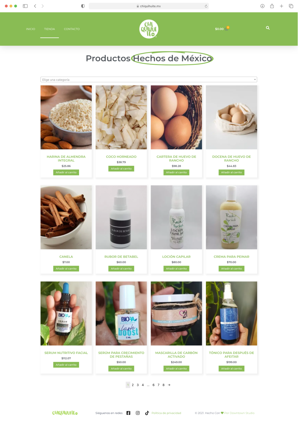
Store page
To meet the launch deadline there was one design for the store page
Product page
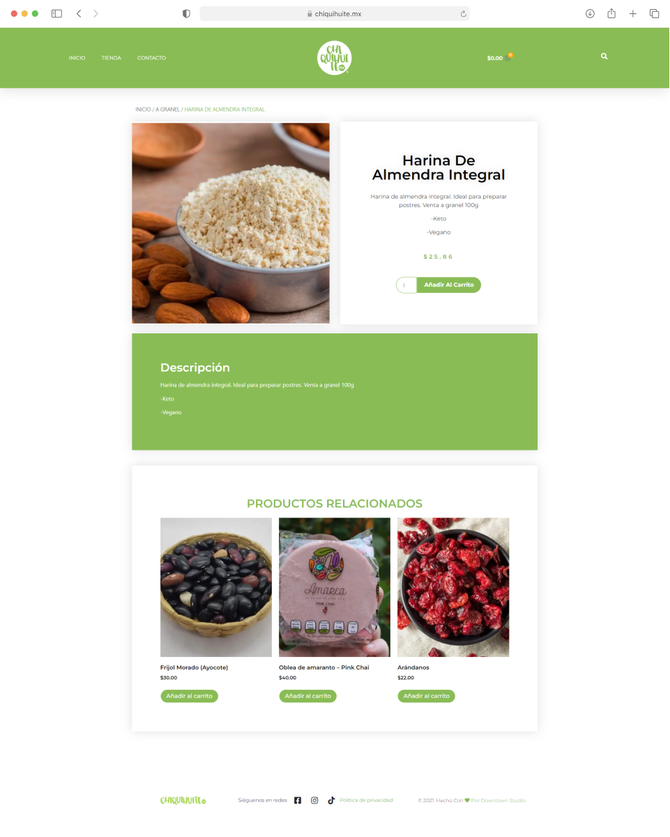
Like the store page, there was only one design for the product page
Stakeholders Training
Enabling the stakeholders for a successful launch
In preparation for the Chiquihuite MX e-commerce website launch, it was crucial to provide the key stakeholders with the necessary training to manage the online store effectively.