Appointment Booking Revamp for Telehealth
Zócalo Health is a virtual family medicine service specializing in culturally aligned care for the Latino community. It is on a mission to eliminate barriers to healthcare access by offering same-day or next-day appointments and emphasizing long-lasting relationships over one-time transactions.
Zócalo Health wanted to find out why it had a 75% drop-off rate during the appointment booking process and why some users who booked their appointments were no-shows.
Client
Zócalo Health
My role
UX designer
Tools
Figma
After Effects
Timeline
4 weeks in Spring 2023
Final prototype
My Role
I led the UX design efforts to revamp the appointment booking experience of the Zócalo Health journey. I collaborated with UX Researchers to better understand the users’ needs and uncover potential low-hanging fruit design opportunities during the appointment booking process. My role culminated in creating fully functioning prototypes to present to the Zócalo Health leadership team.
Problem discovery
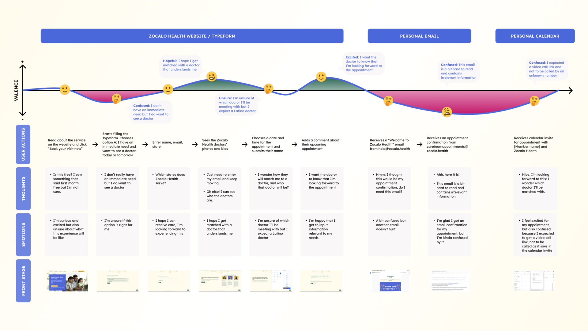
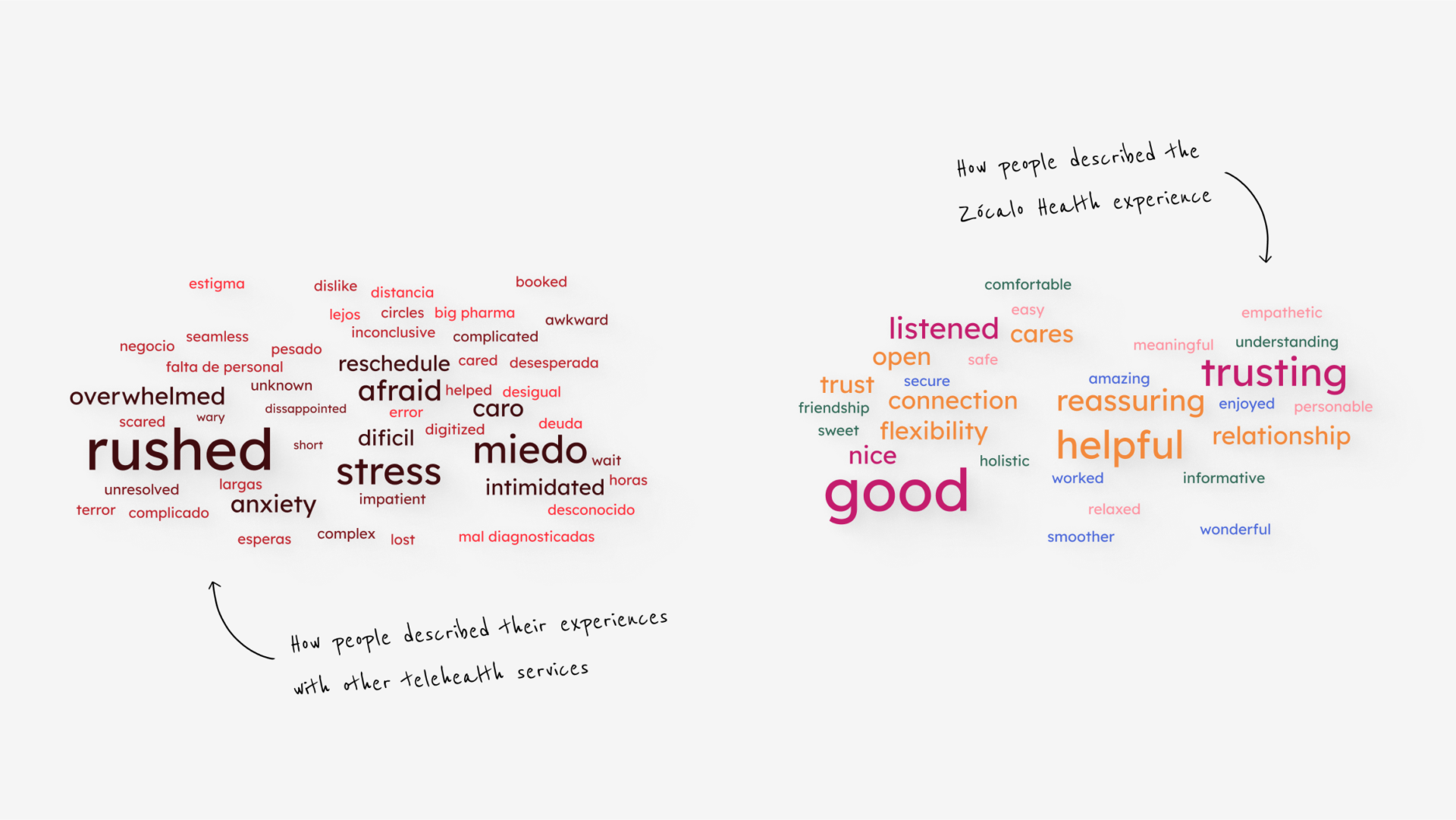
Our team conducted 5 interviews with Zócalo Health users who dropped off or didn’t make it to their appointments. Additionally, we interviewed 5 people who had used other telehealth services to understand what aspects of those experiences were lacking in the Zócalo Health journey.
Pain Points
After better understanding the existing Zócalo Health customer journey and target user, we arrived at the following insights:
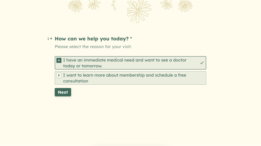
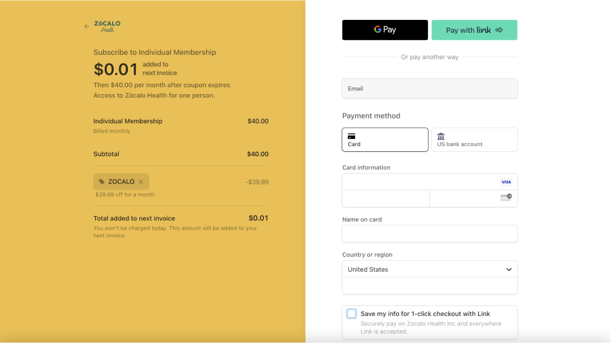
Users wanted to see a doctor as soon as possible. The first step of the Zócalo Health journey was adding friction because it was already cross-selling another offering, prompting users to drop off.
Design Process
- Personae + Word Clouds
- Visual inspiration
- Exploring a solution
- Usability testing
Personae
Based on the information from the interviews, my team crafted a persona as a tool to communicate better the needs, goals, and barriers our target users experience. This persona is the Latina Millennial, representing who I designed for.
Latina Millenial
“The whole healthcare system is still something that I don’t quite have a good grasp on how it works. It’s still very unknown to me, even though I’ve had to help my parents and siblings, it’s still something I feel intimidated by…”
Goals
- Receive healthcare services from a trusted provider
- Establish a close relationship with her care providers, being able to revisit them
- Help parents navigate the healthcare system through translation and communication
Barriers
- Doesn’t fully understand the US healthcare system herself
- Tries to access a healthcare system that doesn’t provide culturally competent care
- Long waiting times every time she tries to schedule an appointment and once she is there
Needs
- For the doctor to ask questions about her life beyond her symptoms.
- For her doctor to speak the same language as her in order to avoid translating.
- Feel heard during the consultation and avoid feeling rushed.
- Feeling comfortable and able to ask questions to the doctor.
Tasks
- Read documentation related to healthcare services
- Find recommendations about trusted providers
- Make calls to gather information and schedule appointments
Visual Inspiration
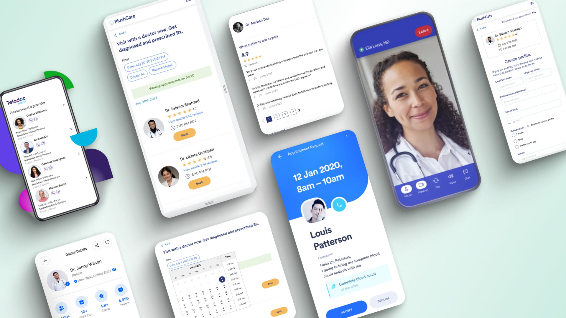
During the interviews, people mentioned what they liked and didn’t like from previous experiences with telehealth providers like Teladoc, Amazon Clinic, and PlushCare.
They wanted some aspects of those telehealth experiences blended with what they already liked about Zócalo Health.
Therefore, I used them as visual inspiration to mix with the Zócalo Health brand.
Exploring a Solution
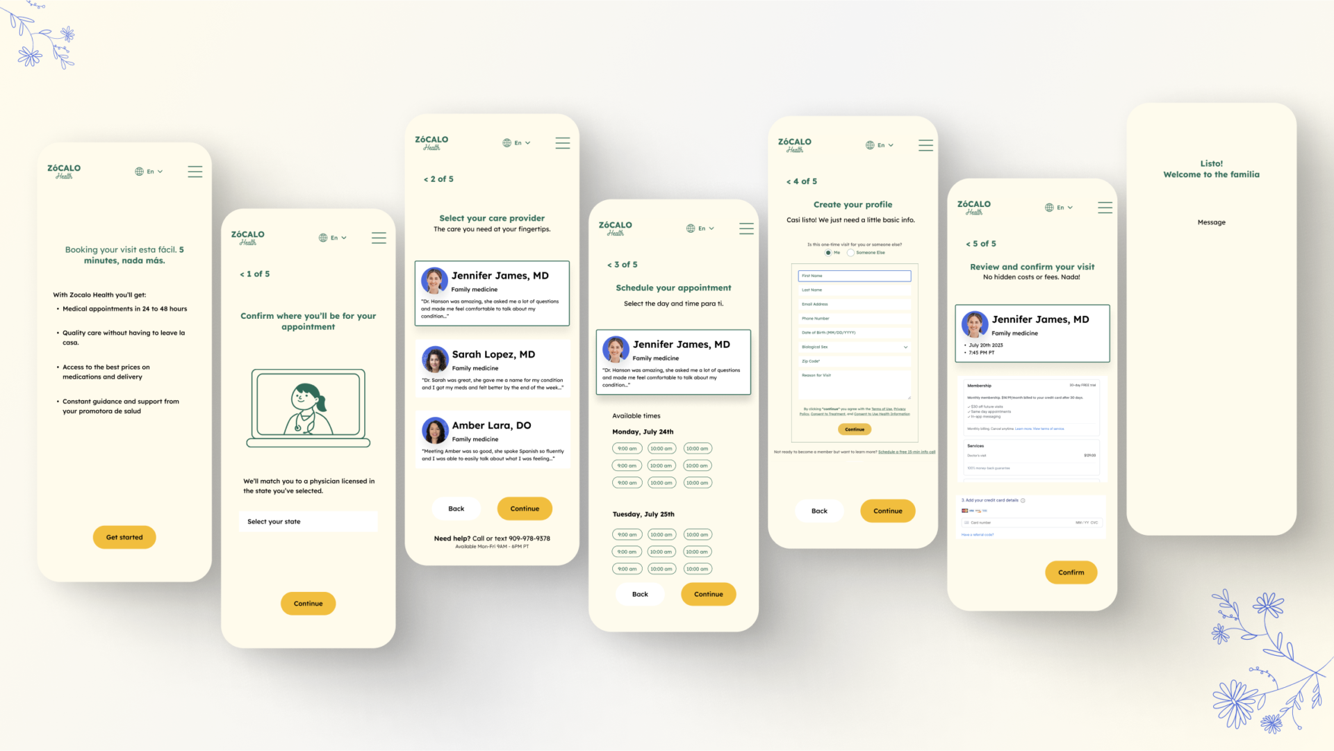
Based on the visual inspiration, following Zócalo Health’s brand, and integrating our interviews’ findings, I created the first mobile-first design iteration for the appointment booking process. I made new brand doodles to enhance the visual journey and started working on the information layout at each step of the process.
Usability Testing
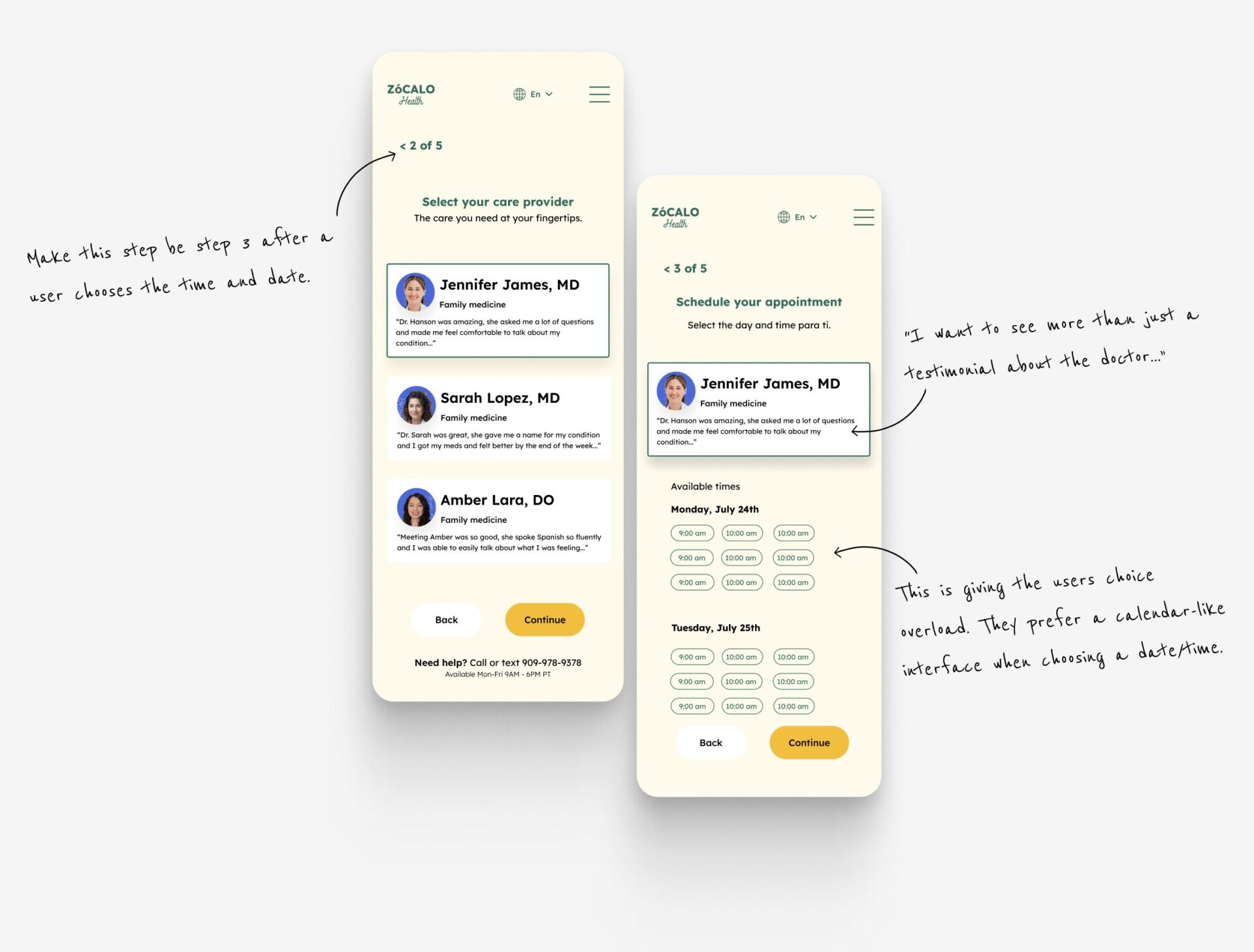
We took the first design iteration and decided to do some quick usability testing with people who had used telehealth before but hadn’t used Zócalo Health. We wanted to learn what could be improved, what expectations hadn’t been met, and what was lacking. We uncovered the following:
- Users expected to interact with a calendar-like interface when selecting a date for their doctor’s appointment.
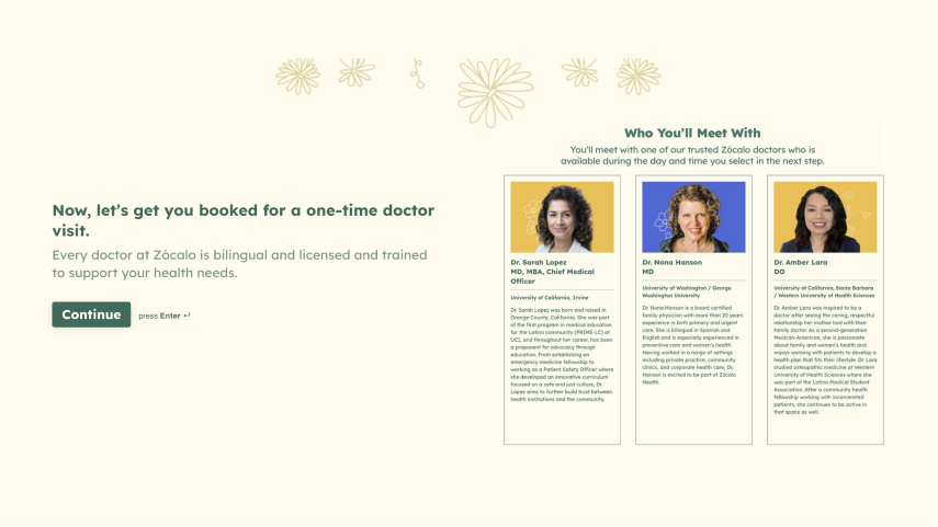
- Participants wanted to see more than just a testimonial about their doctors when choosing them.
- People wanted to choose a date and time before choosing their doctor. That way, they could see which doctors are available at the user’s preferred date and time.
New Experience
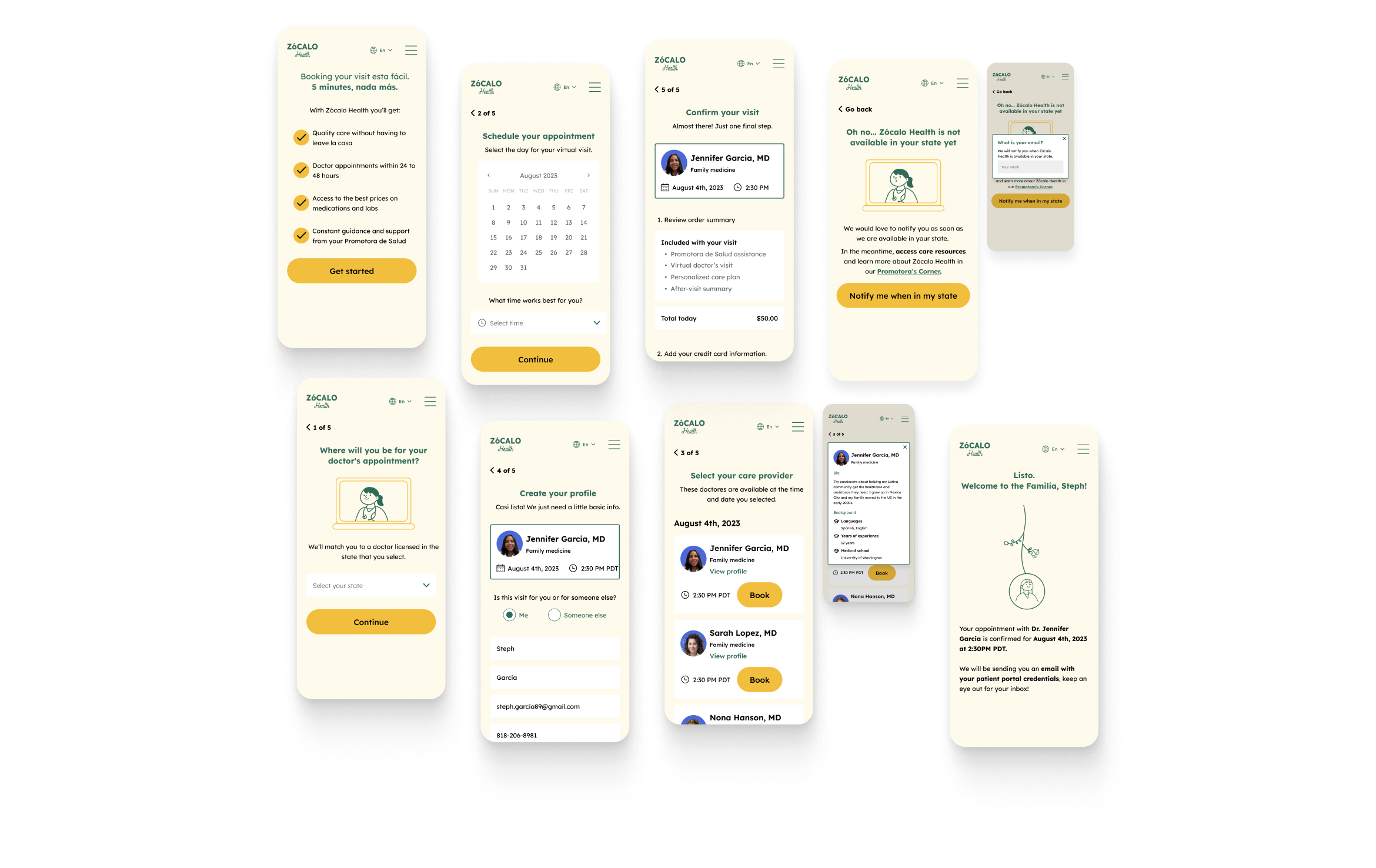
The new design I created directly addresses pain points by allowing users to choose their doctor and learn about them. It removes any cross-selling intention, displays what is included during the appointment, and delivers more straightforward instructions and information via email after booking the appointment.
Additionally, the new design keeps the “Spanglish” tone across every step to deliver a familiar voice for Latino users.
User Flow
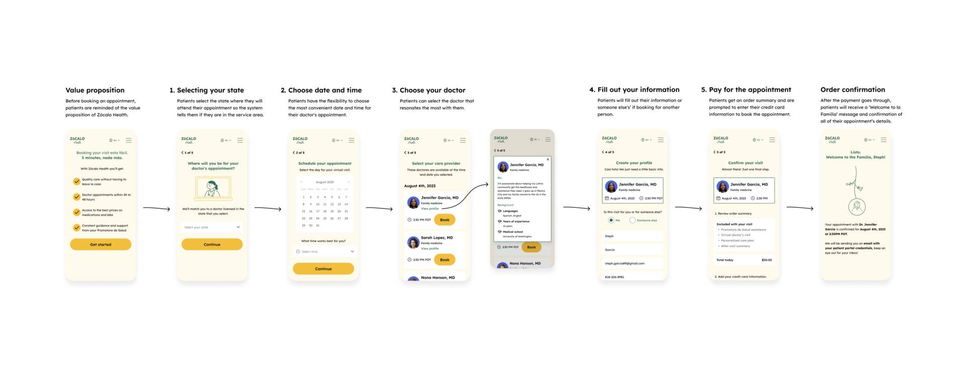
To help users book a doctor’s appointment as quickly as possible, the flow I designed was kept to five steps and as low-effort as possible while allowing users to select a time and date.
- Select your state
- Select the date and time
- Choose your doctor
- Fill out your information
- Pay for the appointment
Patients outside Zócalo Health’s area of service
Currently, Zócalo Health doesn’t offer healthcare services in all US states. Therefore, it was essential to try to retain potential patients outside the service area.
To do this, I added a feature that when a user selects a state where Zócalo Health isn’t present, they would be made aware that Zócalo Health would like to let them know when they are available and request their email.
Not in area of service feature prototype
Doctor card prototype
Choosing your Doctor
Interviews shed light on people’s desire to choose and to know more about their doctors. What do they specialize in? Do they speak Spanish? How many years of experience do they have? Are there any reviews or testimonials?
I addressed these questions using a component that could display the information when the users tapped it.
Micro-animation Welcome
Conversations with users from the Latino community revealed that there is an embedded cultural expectation that your doctor is more than just your doctor; they can be your friend.
Additionally, they want their healthcare provider to treat them with warmth as they would treat a family member.
Therefore, I created a small doodle animation to delight users and a message that welcomes them to the Zócalo Health family when their appointment is booked.
Welcome to the Familia animation
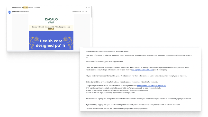
Confirmation email
Follow up email after appointment
Email Clarity
To address the no-shows due to email confusion, I designed new emails that only included the relevant appointment information, had a clear hierarchy in the instructions, and added a button for a one-click action to get to the patient portal.
I also highlighted Zócalo Health’s openness to provide any support to get to your appointment.
Usability Testing the New Appointment Booking
With the help of Francesca, Funke, and Kat, usability tests were conducted to understand better how the new appointment booking experience felt and what could be improved and iterated upon. The following was uncovered during this test:
- The first screen with the value proposition felt like an extra click if you were coming from the website’s home page.
- There is a preference for seeing “patient stories” rather than a traditional 5-star score rating for the doctors.
The new appointment booking experience prototype was handed off to Zócalo Health’s leadership to implement and integrate into their development cycle.
Conclusion
I enjoyed designing for a community I am a part of and for a subject matter that is so critical to Latinos. Revamping this appointment booking experience allowed me to apply and expand my UX skillset to information architecture, usability testing, micro-interactions, and discoverability. Most importantly, it helped me better understand that in healthcare, a good experience is when a patient’s expectations are met and exceeded at every step of the journey.
Looking Back
I would have liked to continue collaborating with Zócalo Health to refine the appointment booking process further and see it fully implemented. Additionally, I would have liked to continue interviewing telehealth users to uncover more low-hanging fruit design opportunities.
